Was at THG Tangs 2.5 years ago.
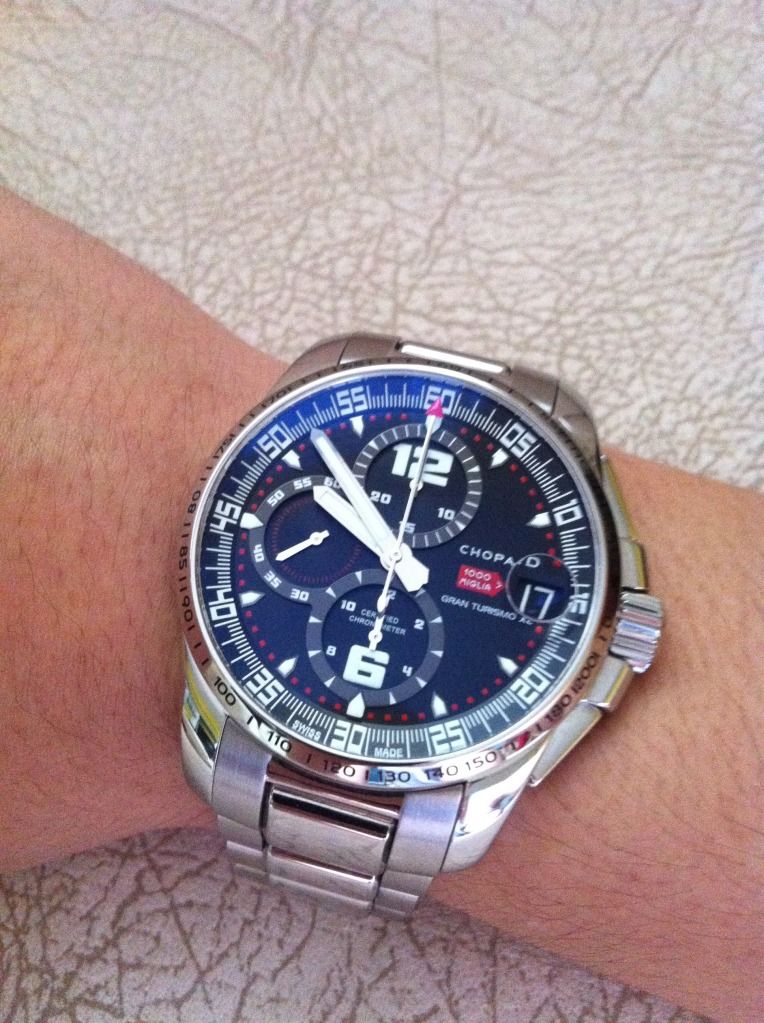
Deciding on whether to go for the now discontinued Explorer2...or this....

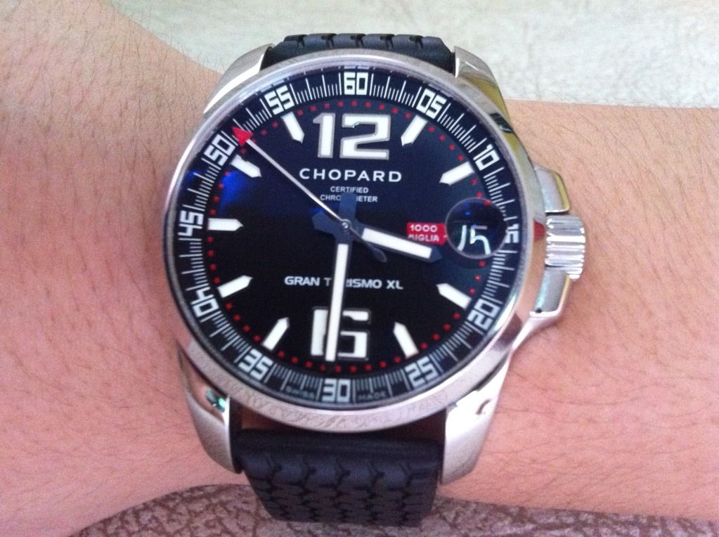
Kinda liked the fact that the word C H O P A R D on the dial was so different from it's usual cursive font. Austere, bold and masculine.
A detailed look all around the caseback and clasp will reveal an incredible amount of attention to detail. The word Chopard appears as many as 6 times all round, as far as i recall.
Bling! Bling! Bling! was the reason i favoured it over the Ex2 at the time.
Which i bought shortly after anyway hahaha
Deciding on whether to go for the now discontinued Explorer2...or this....

Kinda liked the fact that the word C H O P A R D on the dial was so different from it's usual cursive font. Austere, bold and masculine.
A detailed look all around the caseback and clasp will reveal an incredible amount of attention to detail. The word Chopard appears as many as 6 times all round, as far as i recall.
Bling! Bling! Bling! was the reason i favoured it over the Ex2 at the time.
Which i bought shortly after anyway hahaha


Comment